The wombats CD case analysis
The Wombats first album : A guide to love, loss and desperation:

This was the first Wombats album and the song that we are doing for our music video is included on it. “Let’s dance to joy Division”
· It’s is an animated front cover and can be typical of Indie bands as other bands have done this.
 |
| Another indie band cd cover using animation |
· The back of the case is an orange colour and it is quite a warm colour. It goes with the name of the album as it is a guide to love.
· The font is a fun font and is true to indie bands as they like to be very fun and outgoing.
· The actual CD has an image of a Wombat in pink. They have used a picture of a wombat as it coincides with their name. It’s in pink because it is a fun colour and describes their music well.
· When you take the CD out of the case there is a picture of the band and they are sitting on the floor in the middle of town. It shows that indie bands like to be different and individual.
· The inside pullout for the album is very original and is true to indie pop bands as it is a poster of the front cover of the CD but it is reversible. On the other side of the poster it has all of the song lyrics to the songs on the album.
· On the back of the case at the bottom left hand corner it has the record label and their logo. This is a typical convention for all CD covers. Their record label is 14th floor records.com and we would have them as our record label too as they also have other indie pop bands.
The Wombats second album: This modern glitch:

· The front cover is off the band at the sea side with many other people holding pictures of sofas covering their faces. They are also having a picnic. This a very random CD cover and is typical of indie bands as they are usually very random and strange and is exactly what this album cover is.
· The inside of the album is the lyrics to each of their songs and has images of the band as well. This is typical of any band and also for indie bands because the images that are included are very indie and very random.
· When you take the cd out of the case there is an image of the band sitting on the beach and is very indie as it is a random place for people to sit.
· The cd case is a drawing of a robot and is a very indie cd case and goes with the title of the album as it is called the modern glitch.
Noah and The Whale: Last Night On Earth:

· The Cd for Noah and The Whale is just a plain silver case with the name of the band on. This isn’t typical for indie bands because it is very plain and isn’t random.
· The front cover is quite random as it is an image of the band and they are wearing very typical indie clothes.
· The font of the band’s name is in indie and goes with the indie genre of the band. Also, just under the bands name they have all of the song names and this is indie as it is not normally on every cd case and is very different and original.
· The inside of the album has pictures of the band and they are wearing very indie clothes and making very indie faces.
First draft of our digipack designs:

Criticised as being too bright which led us to darken the colours.

We didn't like the colour of the stripes so we darkened them in our final drafts.

Here the stripes are also quite bright and we wanted to change this as our audience feedback said they did not like the bright colours.

We like the band image as it is darkened out however we still feel the colours are too bright and so did our audience.

We changed the background colour of the Cd in our final copy as the orange was again too bright and so were the shapes.

The favourite part of our back cover was the polariod pictures however we decided to get rid of them as it was not a typical convention of the Indie genre.
These were our first draft of our final digipack designs. Once we showed them to our audience we realised that they looked more pop then they did Indie. We decided that this was because the colours were too bright and the audience did not like this. Also, we were not happy as a group with the images of the band members on the back cover. So as a group we talked about how it could be changed. We then decided that the colours needed to be toned down so they were not too bright in your face. We wanted to get rid of the orange and change the font for the cd songs.
Final digipack designs
Below is our final design of our digipack album front cover
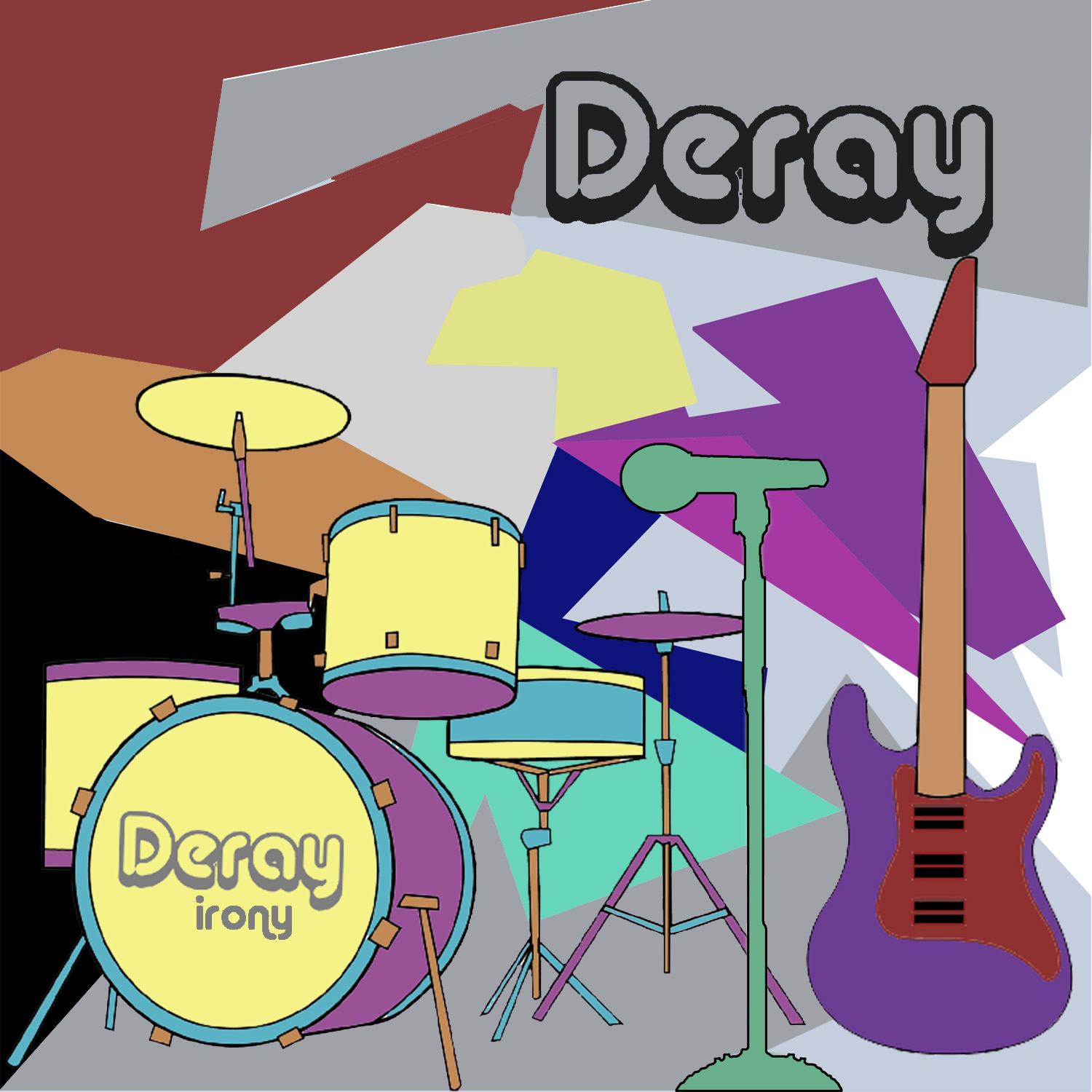
Image: The above image is animated, and is a convention of indie bands and can be seen when looking at Noah and The Whale as they had an animated album cover. We have included the instuments in the image as we thought we would break conventions of not showing the band members faces on the front cover. Like Noah and the Whale and The Arctic Monkeys do.
Copy: We have used quite a fun and quirky font as we felt this is a convention of Indie bands. We have used the minimal amount of copy as we didn't want our target audience to not want to buy the album as there would have been too much text. The copy we used we got ideas from the website dafont. Also we felt the copy reminded us of top of the pops and that was a fun tv program.
Genre: We have gone for the Indie pop genre. We have the Indie within our front cover byt the fonts that have been used, the image and the colours as they are quite relaxing. The pop element within our front cover of the digipack comes from how many colours we have used.
Representation: The front represents our band as being fun, different and quirky. This is shown as the colours show how the band is quirky and fun. The image shows how the band is different as their faces are not on the front cover.
Below is our final inlay number one

Image: The image is of Asha and Partridge. As a result of the band members not being on the front cover of the digipack we felt they should be included in the inlays of the digipack. Both of the images show the personalities of the band members. Also, they are both wearing Indie clothing to go with the Indie image we are trying to portray.
Copy: We have used different fonts for each band member. Asha's font is more flowy as she is a laid back character however very shy. Partridge's font is very stern as she has more of a personality and is more of an outgoing person. We have also used different colours for each band member as this is what many pop bands do today and would work nicely with our Indie pop band. We also have each band members personal sayings to tell the audience more about them.
Genre: Within this inlay we have shown that the band is indie pop as we have used different clours which goes with the conventional pop genre. We have used indie images as they are fun and laidback, like the indie genre.
Representation: Within this inlay we have represented the girls as fun, as seen by Partridge's image, yet serious, as seen by Asha's image.
Below is our final inlay number two:

Image: The image in this inlay is an image of Ryli the male band member. The clothes he is wearing are very Indie as he is wearing chinos. He also looks very incontrol which is a typical representation of males. The image is also of the band together looking happy and having fun. We also have the sayings of the band members as this tells the audience a bit more about the band members.
Copy: Underneath the image of Ryli the copy we have used is quite large and stern which shows Ryli's personality and also goes with his saying down the side of his image. The other copy that has been used is the font of the band as there is a picture of them.
Genre: This inlay goes well with the Indie genre as the images are very Indie due to the clothes that all of the band members are wearing. Also, the colours are conventional of the Indie genre as they are laid back and are not too bright.
Representation: Ryli has been represented as being a very serious band member one the left hand side image, however, on the right hand side image he is represented to be a fun character as he has a smile on his face and is also having fun with the other two band members. Also the female band members are represented as being very fun characters.
Below is our final inlay number three:

Image: We have used another image of the band members as we felt the audience would want to see the band members having fun. Also, when looking through Indie band's digipacks they include many images of the band members. Also the image is on a gray background, with different coloured shapes. This is conventional of Indie bands as Noah and the whale has done animated front covers. Also, it shows the bands fun sides.
Copy: We have just used the band name in this inlay as we wanted to highlight who the band members were so they became well known to ther audience.
Genre: This inlay works well with the Indie Pop genre as their are many colours that have been used for the pop genre and the image is an indie image as the band members have a moody but cheeky look which is typically seen in many Indie band images.
Representation: The band is represented in this inlay as being laidback and ready to have fun as some of the band members are smiling.
Below is the final cd for our digipack:

Image: We wanted the image on the cd to go well with the digipack, advert and music video and is why we chose to have the bands name and the shapes as they are well recognisable. Also, it is very typical for the bands name to be on the cd and can be seen with Noah and the Whale's cd.
Copy: We have used the band name and have coloured it black as then it stands out. Also, it is consistantley the same font.
Genre: When looking at the cd you can see that it belongs to the indie pop genre because it has the colourful shapes that have been toned down so they are not too bright and we also have the Indie font for the band name.
Below is the final back cover for the digipack:

Image: We have divided the back cover into two, the left side is more pop as it has the brightly coloured shapes. The right hand side is more Indie as it is the gray colour and has the purple writing. Also, in the bottom left hand corner we have the conventional bar code, the website for the band, the record label and the copyright sign. This is not only a typical convention for the Indie pop genre but any genre of music.
Copy: We have used a flowy font for the song names as they look very fun. We have also used a drop shadow so it gives them a more Indie effect as it looks more mysterious.
Genre: The genre is deffinatley Indie pop as both characteristics of each genre are seen in our back cover of the digipack as you have the bright colours of the pop genre and you have the chilled out colours of the Indie genre.
There is scope for some excellent analysis here - can we use more definitions and terminology more accurately. Remember that you are looking at the representation of an artist and everything within frame (mise-en-scene) should denote or connote something.
ReplyDelete