Below are some inspirations and ideas for our advert
Here is an advert of the Wombats on the NME frontcover. As you can see the band are very happy and look like they are having a great time.
Above is an image of The Arctic Monkeys on the front of NME. They are promoting Christmas and looks like a very fun image. We would like to use this to help us decide what our advert would be as it looks fun which is how we want our advert to be.
Above is an image of The Wombats advert to promote their new single out. As you can see they have used typical indie colours, brown and they have used bright colours to make the wolf. We will use this for inspiration when making our advert as we like the background colour and how the brighter colours have been used.
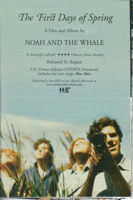
As you can see this is a Noah and the Whale advert. The colours that have been used are very light and airy. It looks very vintage which is the look that we are going to go for, for our advert. The image has the typical conventions of an Indie advert as they are in a field with bright blue sky. We are going to use this as inspiration when having our band photshoots.
Here is our first draft of our advert
This is the first draft of our advert. As you can see the background colour is orange which is a typical Indie colour. We have also used the polaroid pictures as we felt this was quite quirky and is another convention of Indie bands. At the top of the advert we also have reviews from critics which is a typical convention of all genres of music. However, to make ours fit our Indie genre of music we used NME as one of our reviewers as this is where our advert would be placed.
On showing our advert to fellow peers and people who listen to the Indie genre of music, as a group we decided that we needed to change our advert. The main thing we wanted to change was the background colour as we felt it was too bright for our audience and looked more pop than what it did Indie.
Here is our final advert after reviewing our audience feedback
We decided to change the colour to gray as we felt this was more of an Indie colour than what the bright orange was as it has more mystery to it which is a typical convention for the Indie genre. We also added a date to the advert as no-one knew when the album was out, but now they do. We also added where you could buy the album in the bottom left hand corner as we didn't want it to be the main focuse of the advert but still wanted the audience to know where they can buy the album. We also added the Facebook and Twitter logo as our target audience is 16-28 year olds and they are likely to go on these social networking sites so they can then get more information about us on these websties.


No comments:
Post a Comment